Corporate Identity
General
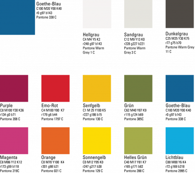
In 2017, FIAS did some major changes to its Corporate Design during this process we implemented the color scheme of the Goethe University. The FIAS logo on the other hand has only seen slight changes. On this side you get al relevant information about the correct usage of colors and fonts within at FIAS.

Logo
Logo Usage
Please use only the logo versions provided on this side. They are always up to date and tend to all needs. On official documents the logo has to be used in its original blue version. To enable the usage on darker backgrounds we offer a white version as well. Attention the white logo is not a simple inverse of the blue original.
Important Notice: Under no circumstances you are allowed to change the logo. This contains the showing of Goethes head, he is an integral part of the logo and cannot be cut of. Even when you use the FIAs logo on one page wit the one from Goethe University it has to stay on!
Questions?
Please contact Patricia Vogel with all questions about the proper use of the logo.
Download the Logo in all common formats here:
Other Templates
You get current templates such as Power-Point, Keynote or poster templates from Patricia Vogel
Business Cards
Please get in touch.
Color-Palette
The Color-Palette of Goethe University

Implementation at FIAS
The basic color of FIAS is Goethe blue, which is used as the logo color, but also in presentations and printed products.
The areas of FIAS are given colors adapted to the new color scheme. In print products, presentations and on the homepage, these colors serve to emphasize the focal points and to facilitate orientation.

Fonts
The main font of the FIAS is still Univers Condensed. If this is not available, Arial or Helvetica can be used as substitute fonts. For serif fonts (e.g. for documents) we recommend Times New Roman or Georgia.
